Style / Reportage
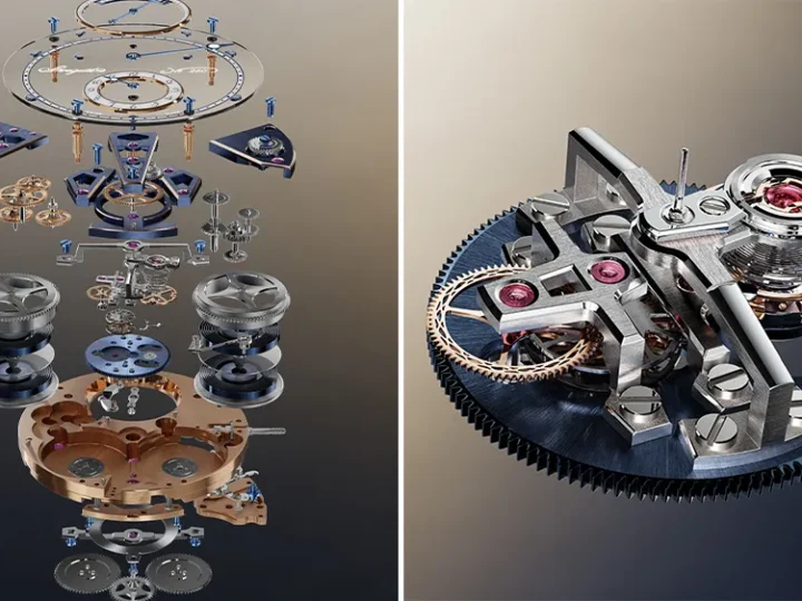
Breguet Expérimentale 1: precision as a design argument
A magnetic escapement and a 10 Hz tourbillon bring the manufacture’s research into the visible architecture of a watch.

THE CURATED EDITION.
Reportage /
Aquamarine, morganite and peridot gave a familiar house geometry a less literal expression.
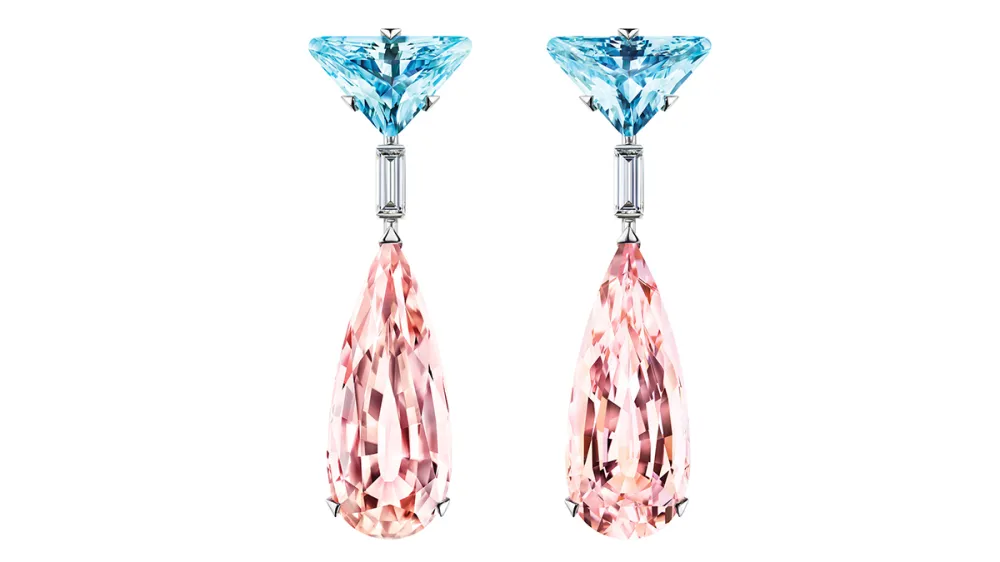
A house symbol becomes more interesting when it does not need to appear as a logo. Prada’s Couleur Vivante approached the triangle through the shape and arrangement of gemstones, letting the geometry become part of the object.
WAYFARER’s January 2026 report described a collection following Eternal Gold. The emphasis moved towards colour, with aquamarine, morganite, peridot and amethyst supplying a different field of contrasts.
The account called the triangular treatment Prada Cut. Applied to aquamarines, it made angle, depth and the way light entered the stone part of the brand’s visual language.
Drop earrings paired blue aquamarine with pink morganite. Baguette-cut diamonds linked smaller triangular forms to larger volumes, while relatively restrained white-gold settings kept the stones prominent.
Rings made the geometry more sculptural. Bracelets and tennis-style necklaces used a subtler expression, including stones combining a rounded cabochon surface with a faceted base.
The design can be discussed without relying on those promotional claims.
Couleur Vivante’s proposition is the persistence of a code through transformation. The triangle remained present, but colour and the structure of the stone changed how it was perceived. Recognition did not require a literal badge.
CONTINUE READING
Style / Reportage
A magnetic escapement and a 10 Hz tourbillon bring the manufacture’s research into the visible architecture of a watch.

Style / Reportage
The Roman house’s lasting argument lies in the relationship between a recognisable form and the hands that keep changing it.

Style / Reportage
At the intersection of sport, craft and sponsorship, the case does more than carry the prize: it frames the moment before the presentation.