LA ROQQA, PORTO ERCOLE · ARCHIVE / Image: WAYFARER.
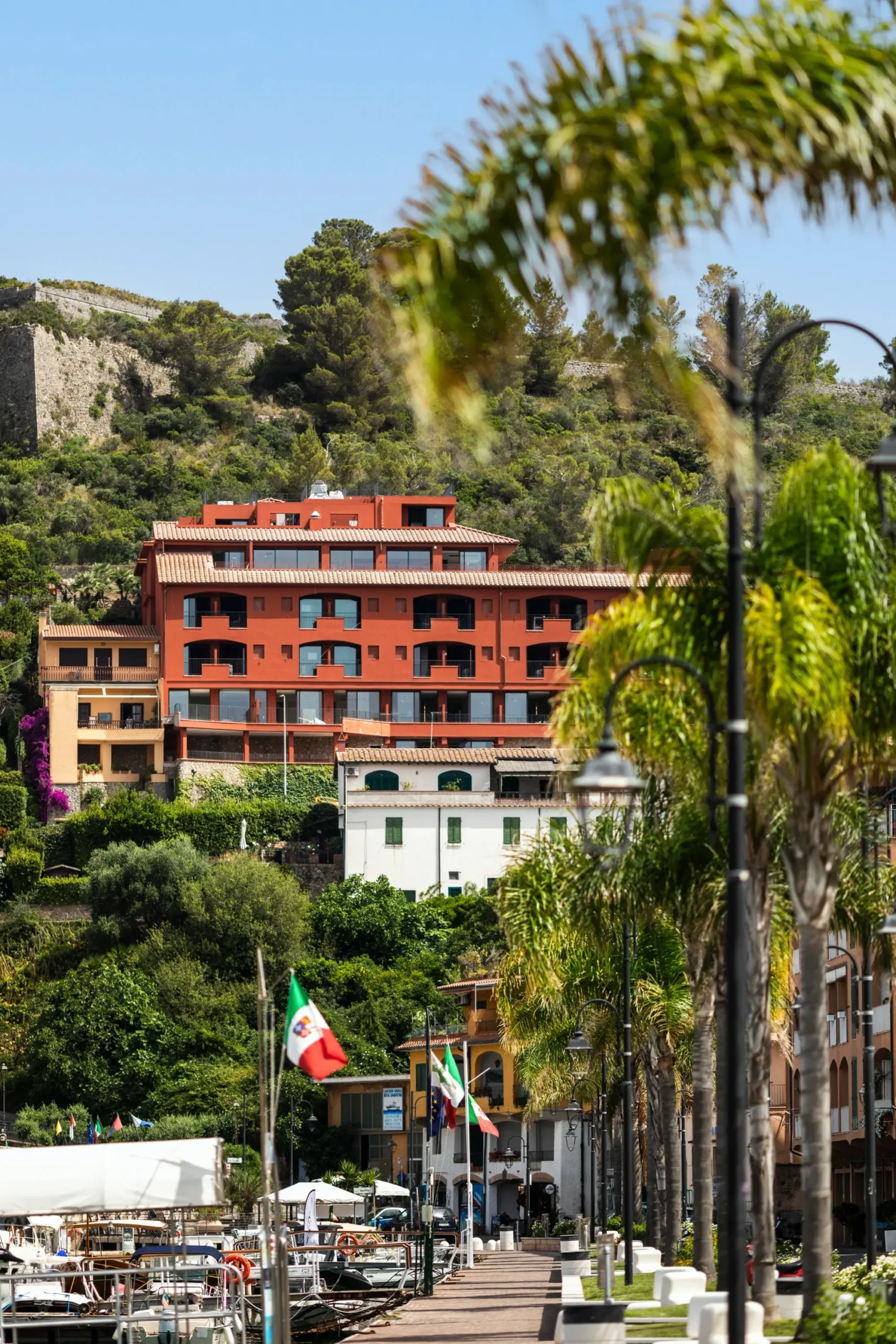
La Roqqa makes its strongest argument through colour. Above Porto Ercole’s harbour, the hotel brings the surrounding landscape indoors without turning every room into a coastal postcard.
The property grew from the Jonsson family’s interest in Argentario. A three-year renovation reworked an existing building with Milan-based designers Ludovica Serafini and Roberto Palomba. That starting point matters: the project had a structure and a village to respond to, rather than an empty site on which to impose a self-contained world.
A palette with an address
The designers organised the rooms around three colour families: sienna drawn from Porto Ercole’s façades, greens associated with the vegetation, and deep blue from the sea. The suites use a sandy base with colour introduced through furniture. Across 55 rooms and suites, the distinction makes the interior varied without abandoning a shared vocabulary.
Colour here does more than suggest a holiday. It connects an abstract surface to something outside the window. A blue room can remain unmistakably contemporary while referring to Argentario; a green one need not reproduce a garden to acknowledge the vegetation around it.
Materials, not a decorative theme
Terracotta, wood, clay, leather and straw weaving belong to the project’s account of regional craft. Palomba Serafini designed custom furnishings throughout the hotel, alongside references to Italian design of the 1960s and 1970s. The combination gives the rooms a domestic register rather than a uniform catalogue look.
A spiral stair connects the entrance to the mezzanine. Large windows and terraces open another route through the building, this time towards the harbour. These two gestures establish different scales: the stair makes the interior legible, while the view keeps the hotel attached to Porto Ercole.
The coast has a hinterland
Scirocco’s panoramic terrace extends that relationship into the restaurant. The hotel describes cooking organised around seasonal vegetables, meat and seafood from the day’s catch, with a wine list limited to regional labels. The stated approach gives the coastal view an agricultural hinterland.
Scirocco: the view reaches the table
Reds, navy and white extend the terrace’s social setting beyond a neutral seaside palette. The regional wine list gives that view a boundary of its own: the cellar’s selection looks inland as well as towards the harbour.
Roasted octopus and spaghetti with fresh tomatoes featured in the documented kitchen repertoire. These preparations explain the coastal subject without making an older menu a permanent promise. The table shares the rooms’ geographical frame, but speaks through ingredients rather than colour.
Isolotto Beach Club supplies the project’s seafront counterpart. Between terrace, room and shore, La Roqqa changes the point of view without changing the subject. The destination remains Porto Ercole.
La Roqqa · Via Panoramica, 7, Porto Ercole, Italy.
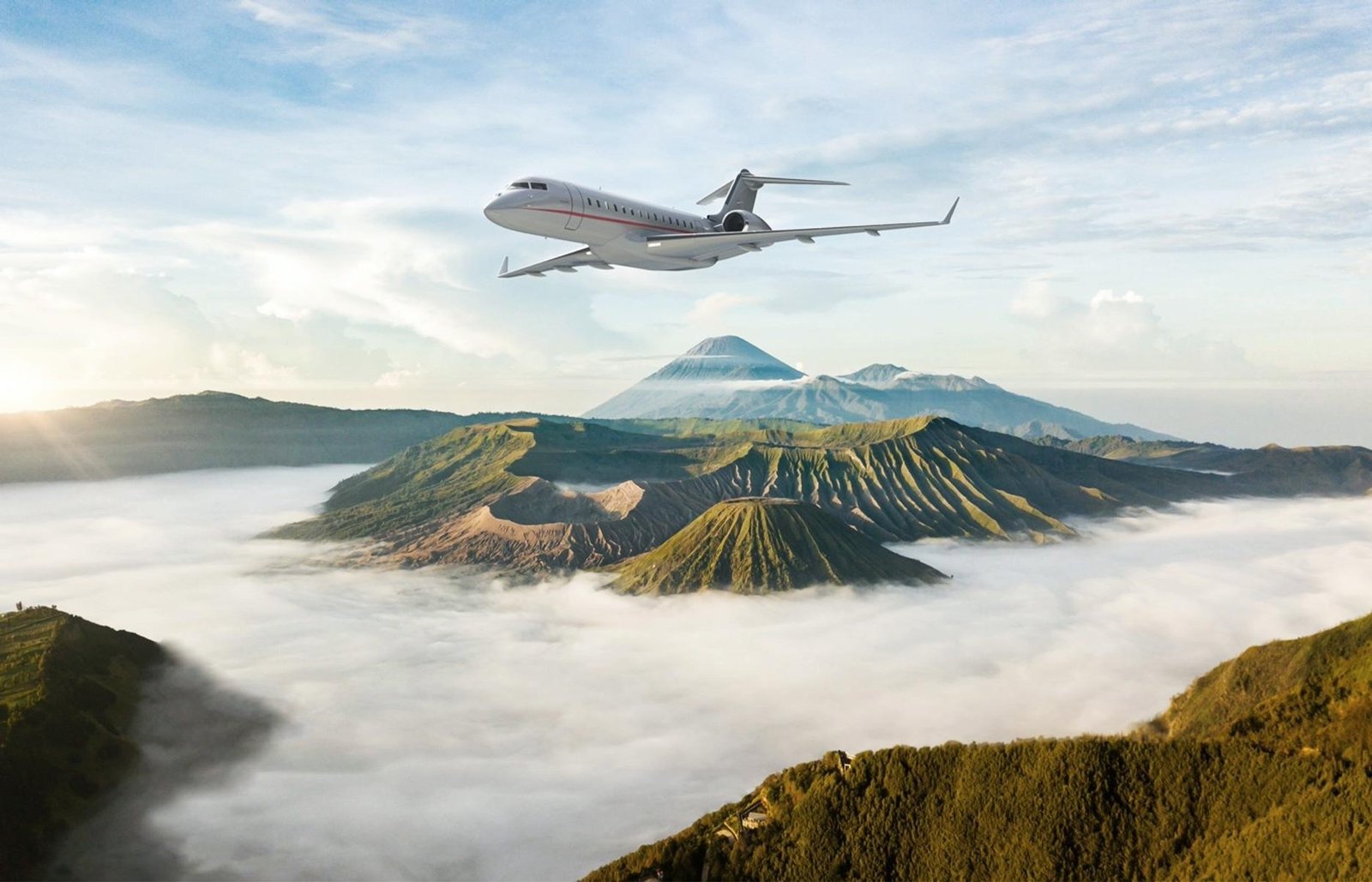
Four Seasons, Aman, Maybourne, Belmond and Mandarin Oriental now sell the journey as part of the stay, from helicopter transfers into London to 23-day circumnavigations at $238,000 a head. Who flies, why, and what is really being bought.
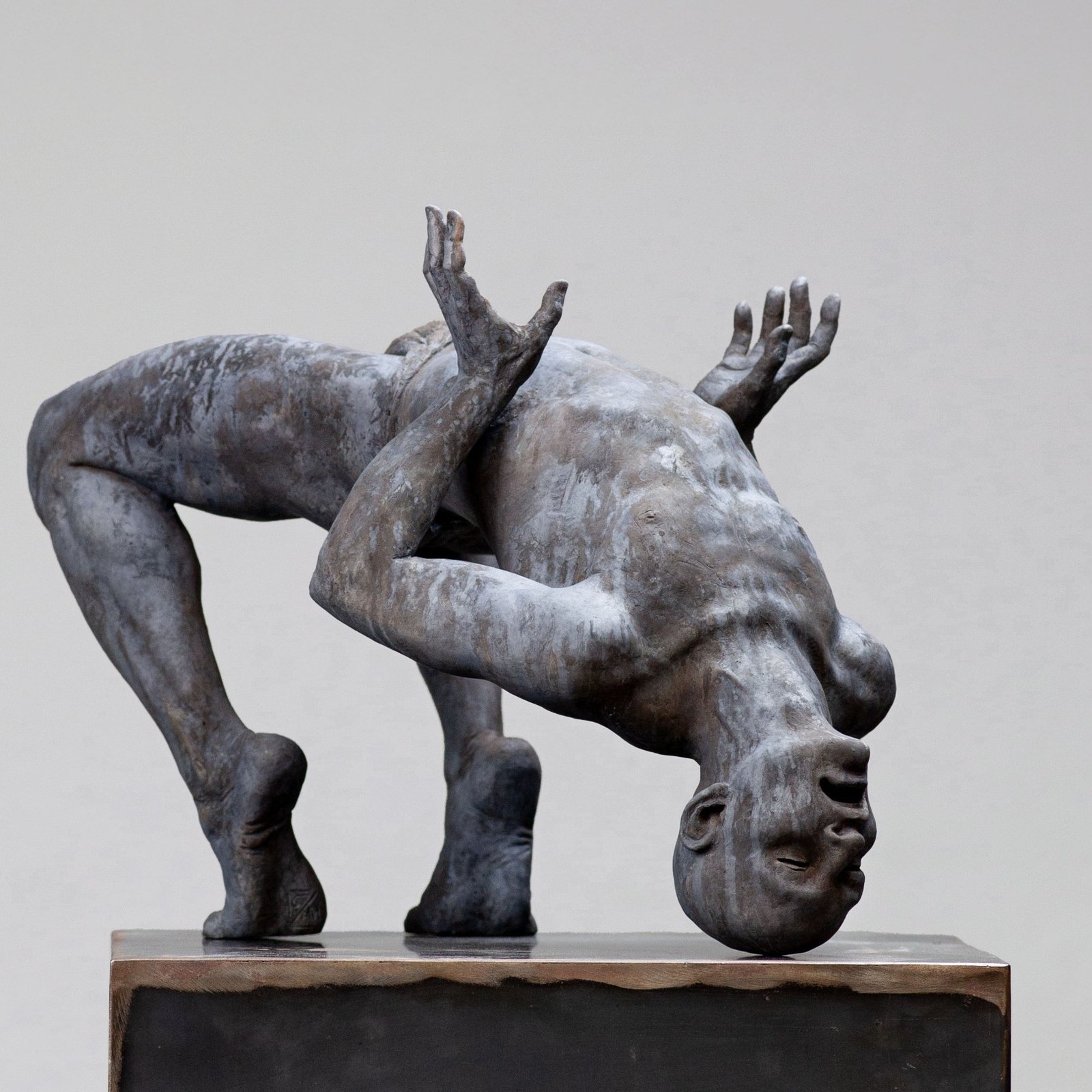
Airlifted by helicopter to the summits, monumental bronzes by Coderch & Malavia turn Courchevel's slopes into an open-air gallery, with Arman back in 1850.
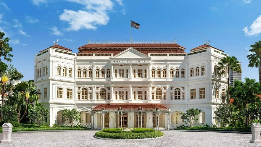
From the Hôtel de Paris in Monte-Carlo to Raffles in Singapore and a Mandarin Oriental in Bangkok marking 150 years, the grand hotels that have stayed relevant for more than a hundred years without surrendering their identity.