Design / Reportage
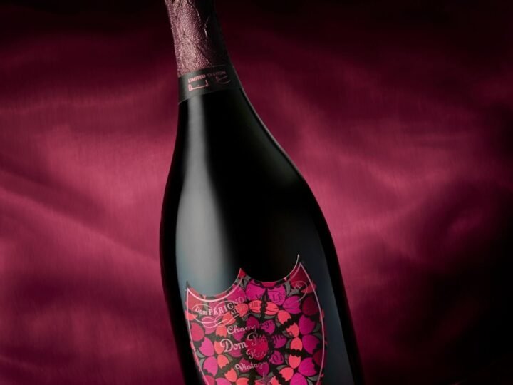
Dom Pérignon and Damien Hirst: symmetry on a label
A butterfly composition supplied a visual language for the champagne house’s 2026 collaboration.

THE CURATED EDITION.
Reportage / Rome
A 1942 bracelet gave the Eternal collection a geometric starting point in overlapping gold elements.
FROM THE WAYFARER BRAZIL ARCHIVE / English adaptation. Date shown is the original publication date.
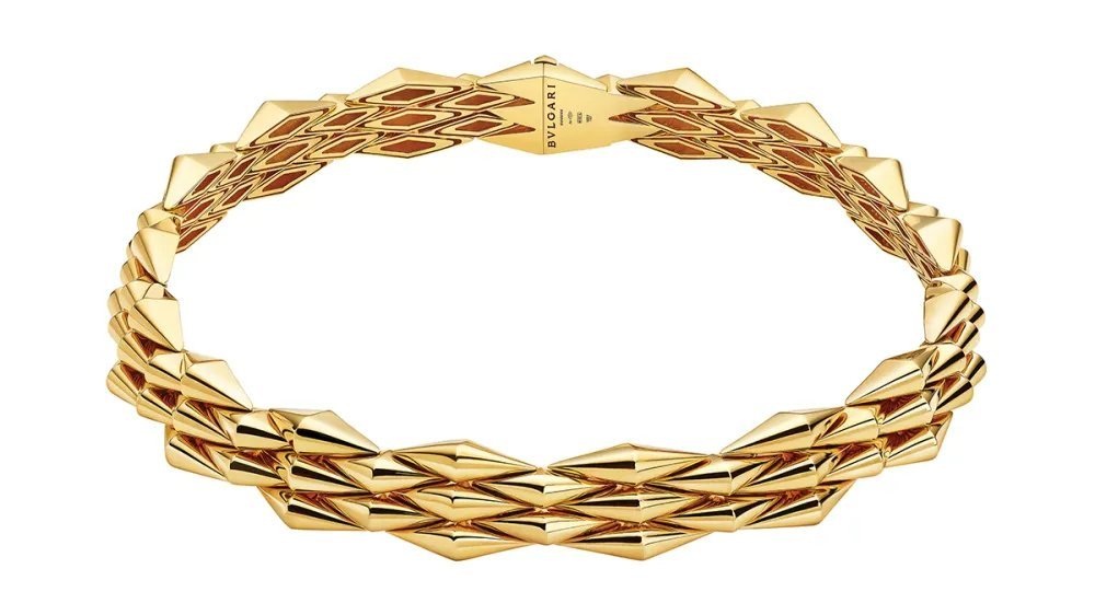
An archive can provide a structure rather than a quotation. Bulgari’s Vimini collection began with a bracelet from 1942 and used its basket-weave logic to develop a broader family of jewellery.
WAYFARER’s February 2026 account traced the original design to woven baskets associated with ancient Rome and Greece. Overlapping diamond-shaped gold elements gave the surface its rhythm, alternating solid volume with openings. The reference was readable in construction, not simply applied as ornament.
Within the Eternal collection, that arrangement extended to a ring and necklace. Earrings explored two directions: an articulated pendant version and an ear climber. Both carried the same geometric starting point into a different relationship with the body.
The archive also described high-jewellery experiments with black diamond-like carbon finishing, diamonds and yellow gold. Their contrast shifted the visual register while retaining the weave as the organising idea. Manufacturing and training at the Valenza complex formed part of the original account’s wider discussion of craft.
Vimini’s interest lies in how little the initial premise needed to change. A basket’s repeated structure became a bracelet, then a vocabulary. The historical object supplied the method; contemporary execution supplied another way to use it. This is an archival design reading, not a new product review.
Adapted from the WAYFARER Brazil archive, first published 2026-02-11. English adaptation: 6 October 2026. This is an archival account, not a report of a new visit. Exhibitions, collections and menu details are described in their original context, not as current availability.
CONTINUE READING
Design / Reportage
A butterfly composition supplied a visual language for the champagne house’s 2026 collaboration.
Design / Reportage
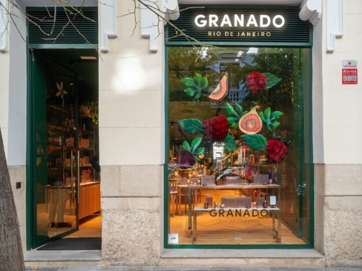
Green panels, botanical imagery and an archive wall connected a Salamanca shop with the brand’s Brazilian origins.
Design / Reportage
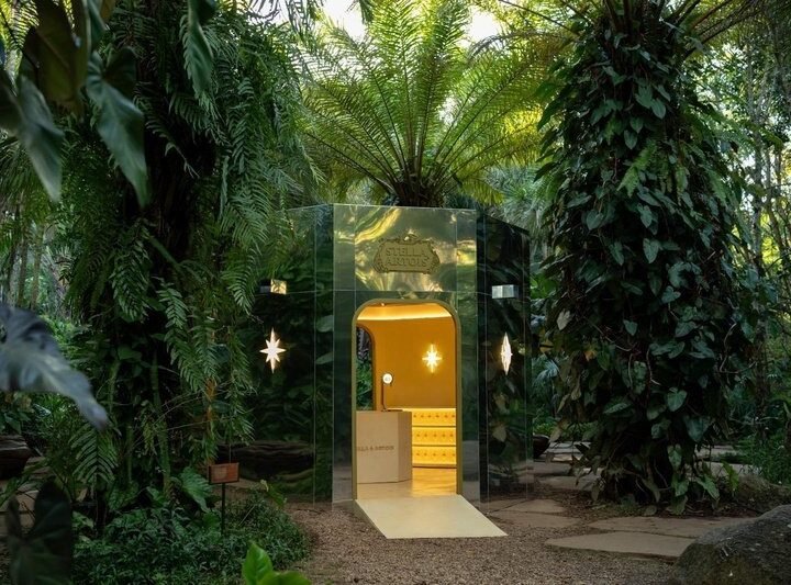
Palma's mirrored structure makes trees and sky part of its exterior, with a contrasting interior beyond an arched entrance.